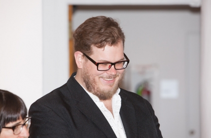
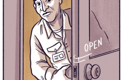
Interview with Matt Rota, New York Times editorial illustrator, Visual Narrative teacher and nice guy
 When did you first get a picture in your head of the profession, “Artist”? How soon after that did you realize you are one?
When I was seven or eight, my mother went back to college to finish her degree and become a teacher, she was also taking some drawing classes, and she would take me with her to school and sometimes to her figure drawing class. I always though that was awesome. It left a big impression. Seeing art in an academic setup like that made me realize I could study art at college and learn how to make drawings for a living. Watching my mother draw made it look like so much fun, so I began drawing very enthusiastically at a pretty young age.

Recently, you’ve been getting big props for your editorial work. The stuff in The New York Times is fantastic. At the same time, I see you’ve been leaking out some comic book work. What are you getting at, Mr. Rota?
I’ve always done short little comic stories, things for anthologies. One that I worked on with Sean T. Colins called Cage Variations is up on studygroup.com and is probably the longest story I worked on. I would like to work on a longer comic project, a graphic novel would be fun. There are some ideas I’ve been toying with and working on (no visuals yet) but it’s a long process. If I can get a story together I feel good enough about to turn into a comic, then you’ll see more work like those comics I posted recently. But I can’t say when that will be yet.
What creative work were you proudest of in 2013? What do you hope to tackle in 2014?
Well, the first part of the year was dedicated to wrapping a painting show up. That was exciting because the show was in Paris, and I had never shown in Paris. That was a lot of fun. I did a couple of interesting Op Eds. One for the article written, or dictated to his lawyer, by a Guantanamo detainee about his hunger strike. The article was really powerful, and had a big impact. It was exciting to follow that story. And I also worked on an article by Julian Assange about government spying.
In 2014 who knows? I’ll keep doing freelance job work. In my free time I’ve been working on these large (for me) pen and ink landscapes. One was in a show at Last Rites Gallery a couple months ago. So a more long term goal is to get a body of those together, and have a show.
Also, as I mentioned in a previous question, I’d like to start a longer comic project, something I wrote. But that may be a more long term plan.
I’m a writer so I know bupkis about this feud I keep hearing about. Fine Art vs. Illustration. Discuss.
There is a long history there I think.
I think when Illustrators started to become distinct from painters with poster and magazine, book, advertising and other print media of the 19th century, you had artists who were getting famous for work in print, like Beardsley, Rackham, Dore, Daumier, Toulouse-Lautrec. These are European artists that in their time, stood shoulder to shoulder with traditional painters, their contemporaries, artists like Sargent, Degas, Whistler, Turner,
The dynamic I think shifted with the birth of the avante-garde culture in art. A movement that saw itself (or at the very least was seen by outsiders) as reactionary against a modern industrial society — the act of creating art needed to be a revolutionary act against mainstream society. This was total shift in how people saw the role and responsibility of the artist in society. The avant-garde since then seems significantly focused on the artist’s unique and special genius. The body of work created by the artist encompasses the unique world view of the artist. The artist is the creator and interpreter of meaning, but that does not necessarily make the artist the creator of images or objects. In this way the artists ideas and interpretation are the prime focus. The craft, and what they actually make can be secondary, or non-existent. This is a mindset that puts the culture of fine arts at odds with illustration. An illustrator is thought of as an interpreter of content, but not an author of it, and therefore not a true genius according to the above interpretation fine art. From one vantage point, it’s hard to comprehend the personal nature of illustration, and easy to see it purely as a craft driven enterprise. Also, the social context of the avant-garde is anti-bourgeoisie, anti-establishment, one on the fringes. Due to the commercial nature of illustration, it is solidly bourgeoisie, very uncool by the hipster standards of the turn of the century.
One thing to point out is that the rivalry between the two points of view may be, the way we see it today, uniquely American. During the first half of the century in Europe there were blurrier lines that separated the artistic spheres, Modernists like George Grosz, Otto Dix, Frans Masereel, Lyonel Fenninger, and a bunch of other Artists with a capital A worked broadly between commercial illustration and Fine art. But in our American history books, these details are often left out. In the U.S., illustration had a central and much more prominent role than than American painters working in the European tradition (I’m thinking of the N.C. Wyeth era, Howard Pyle, Maxfield Parish, etc…) prior to World War Two.
During the war era a number of European artists and intellectuals emigrated to New York, The armory show had come to the city and left an impression. Thinkers like Clement Greenberg were penning theories about an emerging American aesthetic in the avante-garde of the east village (Jackson Pollock, William Dekooning). The main (or at least most famous) argument that separates fine art from illustration today was captured in a Greenbergs 1939 essay: Avant-Garde and Kitsch:”Kitsch, using for raw material the debased and academicized simulacra of genuine culture, welcomes and cultivates this insensibility. It is the source of its profits. Kitsch is mechanical and operates by formulas. Kitsch is vicarious experience and faked sensations. Kitsch changes according to style, but remains always the same. Kitsch is the epitome of all that is spurious in the life of our times. Kitsch pretends to demand nothing of its customers except their money—not even their time.”
That about sums it up I think!
By the way my opinion is that this argument oversimplifies the complexities of each sphere, Illustration as a business is full of artists with very personal bodies of work and function with the same motivations as a fine artists. And the fine art world, especially in today’s art fair, auction house-driven model, cannot claim to operate on the fringes or as a reactionary/revolutionary cultural force, unshackled or uninfluenced by monetary interests. I do think when illustrators imagine the audience they would like to reach, it’s broad and inclusive, and they think about where it will be seen—it’s on TV, in books and can be bought for under $20.
When one decides to be a fine artist they imagine an audience that’s exclusive, elite, and when they imagine where it can be seen, or had, it’s in small galleries on side streets, for tens of thousands of dollars.
Your work strikes me as illustration with a fine art sensibility. Or maybe it’s fine art with an illustrative sensibility. Maybe you can help me save face, and tell me that you get this a lot?
Yep, I get it all the time, I studied fine art in undergrad, and illustration in grad, and I can’t fully commit to either point of view completely. Studying fine art provoked me to focus on my unique personal and cultural experience, and to be conscious of the fact that everything I created somehow reflected this point of view. So as an illustrator, even though the majority of work I get commissioned to do is based on someone else’s writing or idea, I view what I do as a personal interpretation of the content.
I usually only get stories and topics that I have a particular interest in, and an opinion about. Even though the individual work pertains to a specific article or story, as a whole, my body of work relates to larger, and more consistent themes, that reflect a general world view of mine. The idea of a body of work doing that is more of a fine art notion, but I think it is important for illustrators to be conscious of that in their work because it gives more significance to your point of view. If all your work reflects a particular sensibility of point of view, people will trust the sincerity or the intention of it, you no longer are just a technician rendering other peoples ideas, you become a free thinking author of your own ideas. It makes you a better storyteller if you have a personal or emotional connection to your content.
When I went to your blog to research this “Matt Rota” I found a list of accomplishments on your bio page. Very impressive! While on that same bio page, I spotted a link titled “View My Complete Profile”. I clicked on it and was taken to a page that had the exact same information. Which leads me to believe you’re hiding something. What did you leave out of your profile that we should know?
Ha, well for professional purposes, I post only what’s necessary! I would say “what else do you want to know?” But since this question is part of a larger interview, I assume you must have already asked everything you wanted to know!
Touche!
Okay, I want to make a big, bold, marginally stupid claim so that we can get in a fight and piss off our readers. Just another Tuesday around here.
We’re both part of the Visual Narrative faculty team, but I bet we have very different definitions of what “visual narrative” means and the dynamics of its creation. Let’s put that bet to the test. I think visual narrative as a creative process with a successful final product, must start with the wordsmith in us. That little punk who thinks he knows what to do with your ideas and verbalizes his gems in your ear with words. Then the visual side of the brain kicks in and shows the wordsmith what’s what. Gets it down and goes with it. To be clear, I know we can be inspired to tell a story by images, but to tell an effective, clear story the words in your head need to come together and make that special brew.
I agree with the program’s premise, of course. The premise being “If the writer can be a visual artist, and the visual artist can write then we’ll get better stories”. But I think the wordsmith in our head always needs to go first if we want to the story to come together and make sense.
Stop [virtually] looking at me like that…
Hmm, I agree with you in part. There are times when an idea comes as a concept, “I’m going tell a story about-” And whatever that “about” ends up being you orient yourself visually to that subject. If you are collaborating with a writer on something, a comic, a movie, an article, you’ll have that experience. But if you’re the one authoring, the idea may just as likely come from a visual experience. For me, most of the time I’ll see something, a person, I’ll be in a particular place, there will be something about the mood that I’ll feel. I’ll have an emotional reaction to the moment, and an idea, a story will come out of it.
Flipping through books and magazines, not reading, but just looking at the pictures, dissociating the image from a story or text makes them more mysterious. When the context of an image is more mysterious, it becomes more interesting. It forces you to imagine a context for it. So, essentially you’re creating a story.
Another way of thinking about images like this is dreams. Dreams being a mostly visual experience they have an inherent surreal abstract quality. It’s hard to say what dreams mean, or how to interpret them, but they inspire interpretation. Whether or not they hold any meaning at all, even if they leave you with profound feeling, the act of describing a dream in words is always impossible. You can’t quite capture a dream in words, but words bring something concrete to the experience, a literalness. That dreamlike experience — for an image to move you or impact you — is often likely the inspiration to write.
Words bring a certainty, a clarity, they are necessary to distill a sense of meaning out of situation or a moment or an abstract feeling.
Some of my point was for the sake of argument, but I think there is a natural friction between those of who who craft stories with words and those of us who draw, or sculpt, or film. And I think that friction is identical to the friction we feel inside ourselves as we craft visual stories. To me, the peace-maker, the catalyst that makes the story gel as a clear story has been words that bounce around in my head and, sometimes, make it to the page. So I’m biased.
You’re currently teaching in the Visual Narrative MFA program in its inaugural year. How’s it going?
It’s going great so far, there has been such a wonderful energy with the students, and some really awesome projects. The students all get along well, so there was a real sense of community!
How is it to work for Nathan Fox? Does he delegate like he draws? You can interpret that any way you’d like.
Nathan’s awesome. He’s got a lot of great ideas, and a unique vision for the program, but creatively he’s very open to all of the faculty’s ideas. I have a lot of freedom in how I teach my class, and Nathan has a lot of respect for what I think is important to bring to the class. An ideal work environment.
Is Edward Hemingway really as nice as his students say he is? What if I insulted his grandpa, who was totally under-edited?
He’s even nicer than you’ve heard. I’ll tell him you were insulting his grandpa and see what he does.
What is your favorite tool when you work? Yes, I’m going there.
Pen and ink, or just a simple pencil, simplest is the best! The ink is Higgins Black Magic, the pens are Speedball 102 nibs. At the moment I’m using Faber-Castel pencils, usually between the 2h to the 2-b hardness, Strathmore or Stonhenge paper, and Rhapsody brushes.
Thanks for answering our questions, Matt! You can see more of Matt’s work on his blog and his portfolio site. This guy is incredible.


